Graphiant's Tables
Improving Data Tables for Power Users in a B2B SaaS Platform
01 / Overview
Project: Redesign of the table component used across a b2b saas internet networking platform
Platform: Web (desktop-first)
Users: Network managers
Duration: 8 weeks
Team: Myself (UX Designer), PM, 3 engineers and QA
Graphiant’s tables are a central component of the product used to display and manage data across multiple modules like edge device information, logs and live network information. However, usability issues with filtering, sorting, and bulk actions were slowing down workflows and driving up support tickets.
03 / My Role
I was the lead designer for this initiative, working closely with our PM and frontend team. I drove the UX strategy, research synthesis, interaction design, and developer handoff.
04 / Discovery & Research
We began with support ticket analysis and interviews with customers and product teams. This gave us a baseline understanding of the most common pain points. We then conducted 8 user interviews (4 SEs, 2 managers, 2 customers).
Key insights:
- Users typically worked with massive data sets but only needed to focus on 3–5 key columns per workflow
- Filters needed to be multi-layered (e.g., “Status = Active” AND “Role = Admin”), but the UI only allowed one at a time
- Many users had a hard time dissecting the information in the tables since the UI wasn't conducive to skimming information quickly
- Users wanted to create custom views (columns, filters, sort state) to avoid repeating setup every day
We also audited 3 competitors and identified patterns in customizable table UIs (e.g., column freezing, drag-to-reorder, persistent filters).
05 / Design Process
Ideation
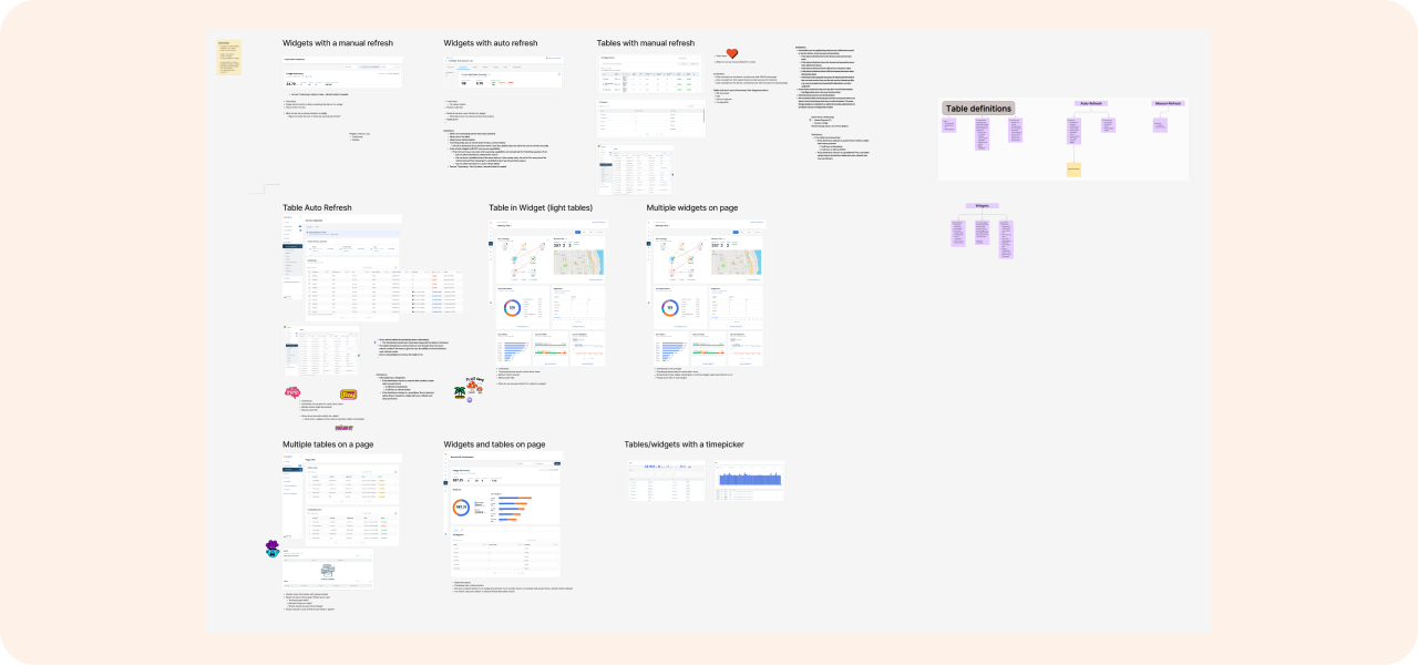
We hosted a design jam within the product team to generate concepts of all of the possible features our tables should have. The team and I audited our own tables to see what patterns we had been using. Since each table was custom coded and not a common component, there were many variations of tables all having different functionality. Some tables were live, some opened child pages, some could be filtered by charts, and some had really minimal amounts of data. We needed common patterns and components to synthesize all of these (and a few more) use cases to create one table pattern that was consistent throughout the portal.
Along with this ask to improve the tables, I was also working on updating our entire design system. We started leveraging PrimeVue and in this UI kit there were pre existing table patterns that we also looked at as a baseline for our table functionality.
Lo-Fi Exploration
I wireframed multiple interaction models:
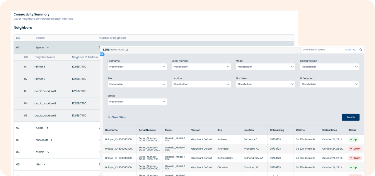
1. Child tables in a sidebar vs a modal vs nested rows
2. Bulk actions in a floating sticky bar vs. contextual menus
3. Editing rows inline vs in a modal
We tested these click-through prototypes with 4 users (moderated).
Takeaways:
- Users preferred child tables in a nested row because they felt like they didn't lose the context of the parent table
- Users preferred sticky bulk action bar that appeared only when rows were selected
- Inline editing felt more intuitive than modals, but wasn't always feasible for our use cases
High-Fidelity Design & Prototyping
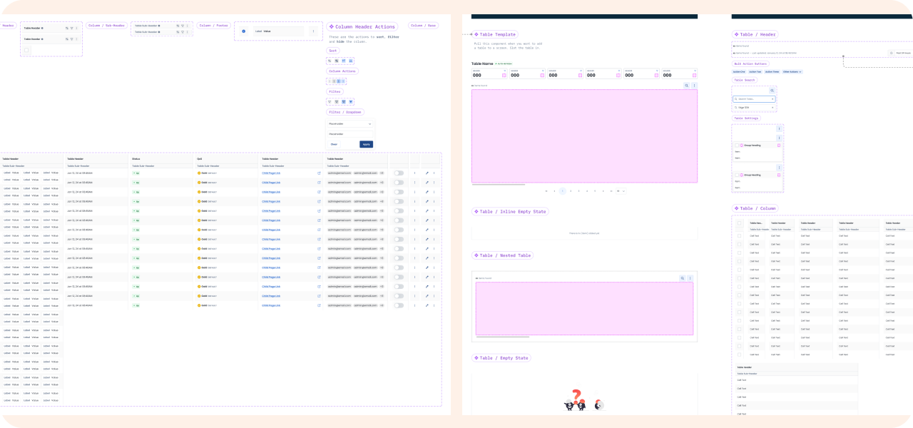
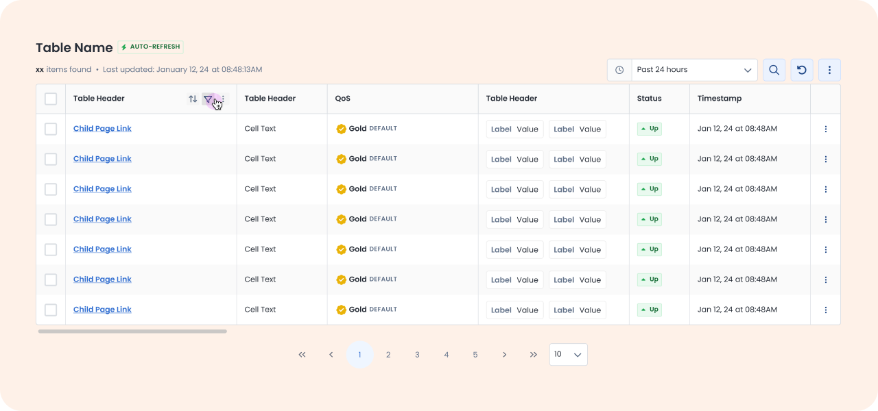
In Figma, I created a flexible, scalable table pattern with the following features:
- Configurable layouts & navigation: headers that adapt between actionable/read-only states, intuitive parent–child page navigation, and smart default column widths with manual resizing
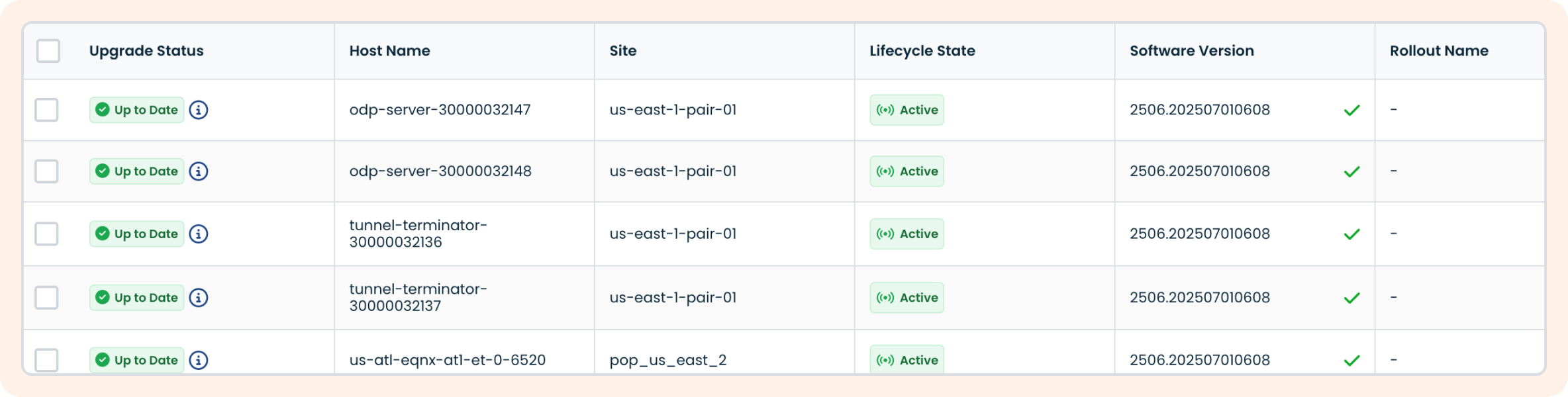
- Streamlined data handling: simplified search interface, enhanced column filtering with multi-select and status indicators, clear update signals for real-time data, and a new low-data, read-only table type
- User controls: direct inline editing for supported tables, plus the ability to hide, freeze, and filter columns
We integrated this into our design system as a reusable component and built variants for different use cases (e.g. configurable vs monitoring vs low data tables). We also worked with dev to create a new common table component in the code base (built on the back PrimeVue tables) so the tables throughout the portal were consistent with UI and functionality.
Validation & Feedback
We ran moderated usability tests with 5 users from our SE team.
Scenarios: customize table view to only see certain columns, bulk deactivation of network edges, filter to only see online edges at a specific datacenter
Results:
- 100% completion for all tasks
- Avg. task time decreased by 40% compared to old UI
- Users responded positively to the streamlined functionality and were able to learn all the new functionality quickly
We also did internal QA testing with the support team to stress-test edge cases like tables with 100+ columns.
06 / Results & Learnings
Outcome & Impact
- Support tickets related to tables dropped by 46% over the following quarter
- Customized views adoption rose from 4% to 52% within 2 months of launch
- Customers cited the new table experience as a key improvement in CSAT feedback: “The table redesign was a game changer — we no longer export everything to Excel.”
Lessons Learned
Working on this project taught me the importance of common components. Having isolated designs & code for each table created a lot of confusion and bloat in out software. Users were constantly confused about why one table could do certain things, while others couldn't and they were lacking clarity and control.
Challenges:
- Deciding which functionalities to keep and remove for the new table types
- Coordinating table behavior across multiple modules with different needs
If I were to do this again, I’d:
- Push for analytics tracking from the beginning to better measure real usage over time
- Involve QA earlier since some edge cases only came up later in testing
