View's Design System
Building a design system from the ground up
01 / Background
During my co-op at View, a frontrunner in smart building technology, my mission was to work on the product team to build a design system from the ground up that incorporated View's updated branding and maintained a consistent look and feel across their products. Their current system was extremely outdated, not built to scale and had very limited documentation, so every component was up for interpretation. With over $2.3B in funding and thousands of customers, the stakes for this project were high.
* Due to my NDA I can’t show all the visuals of what I worked on, but contact me if you want to learn more!
02 / The Challenge
View lacked a consistent and recognizable design system. The use of stock material UI (MUI) resulted in an outdated and disjointed user experience that failed to reflect the company's brand identity. Developers would each decide which components they wanted to use which resulted in different looking date-pickers and hundreds of button styles.
By embarking on this project, the goal was to:
- Unify product teams with a structured design approach for cohesiveness.
- Accelerate design and development by leveraging a pre-existing component library.
- Lay the groundwork for ongoing iterations while maintaining accessibility through WCAG-compliant components.
03 / The Approach
Getting Started
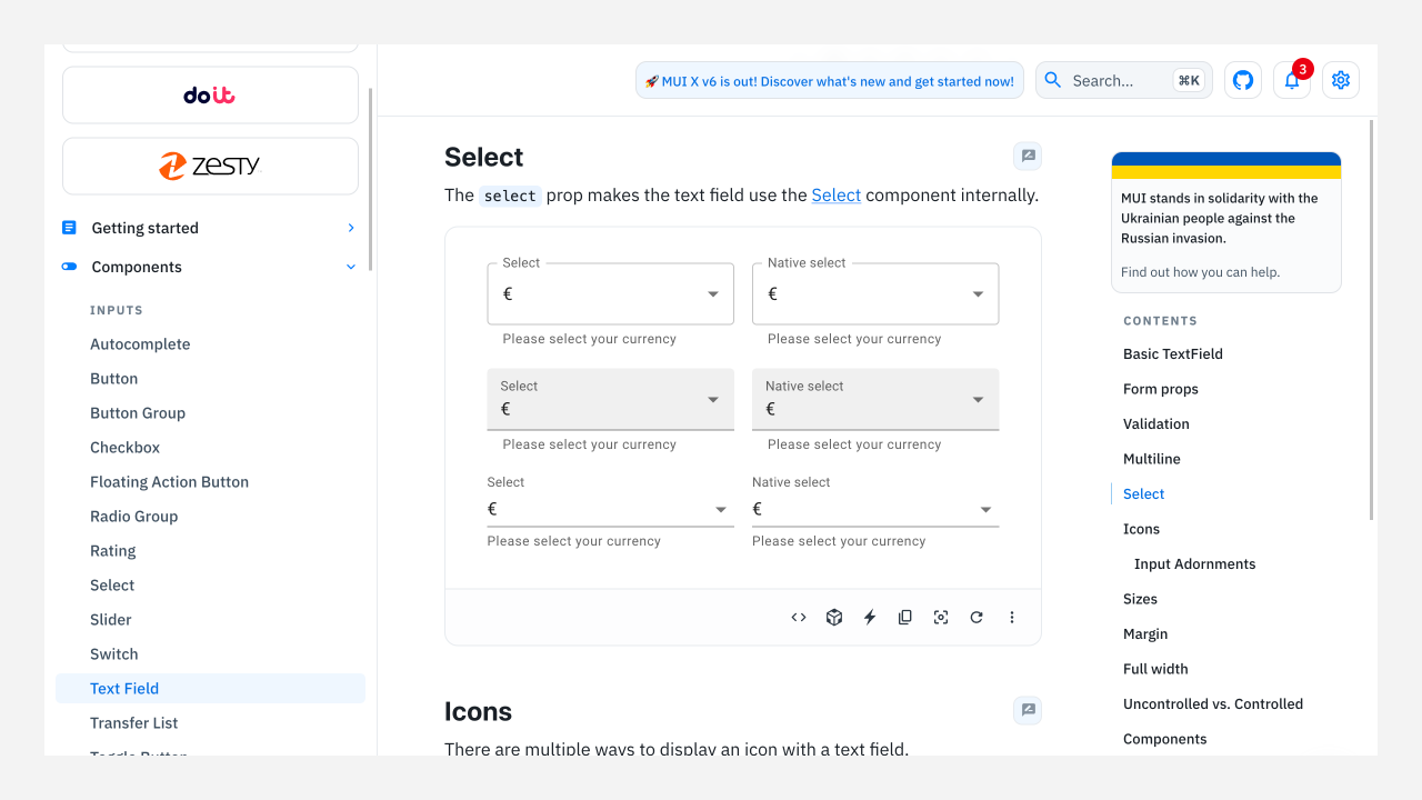
Building a design system from scratch for an organization this size was a daunting task. However, extensive research into other design systems and many endless discussions with the product teams helped me begin piecing it together. I want to give a huge shoutout to the Atlassian, IBM, Microsoft, and Salesforce design teams for their helpful system documentation. I couldn't have built this without you all :)
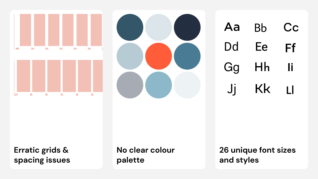
The journey began with auditing the existing system's atoms (typography, color, elevations, spacing) to identify gaps and create a roadmap to address them.
The audit revealed erratic grids and spacing across platforms, inconsistencies in colors, and 26 unique font styles (including 4 versions of the H3 heading style :/)
The Design Process
Based on the audit, it seemed I had me work cut out for me. Our approach was to first tackle the basic elements (atoms and molecules) and progressively handle complex ones (organisms, templates and pages). I paid special attention to:
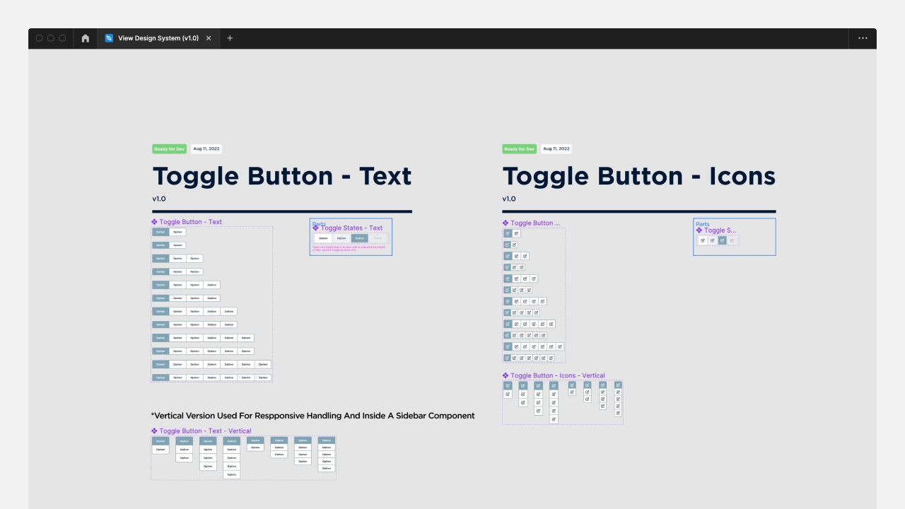
- Utilizing linked styles and variable components in Figma for both mobile and desktop sizes.
- Deciding which components needed their own look and feel and which ones could be reskinned from MUI (in order to reduce dev time)
- Ensuring consistency across component states (hover, focus, disabled, error).
- Meeting the WCAG AA standard for contrast and accessibility.
The biggest challenges I faced during the design process were:
- Coming up with naming conventions for each element. There are many ways to tokenize atoms in design systems, and choosing a direction was more challenging than expected.
- Creating a data visualization color palette. View's platforms use many graphs and charts to represent data, and we needed a palette of about 20 colors that was similar enough to the existing palette but independent enough to help visualize the data. Building this palette was a struggle. I went through at least 8 rounds of iteration before needing to take a break and come back to it later.
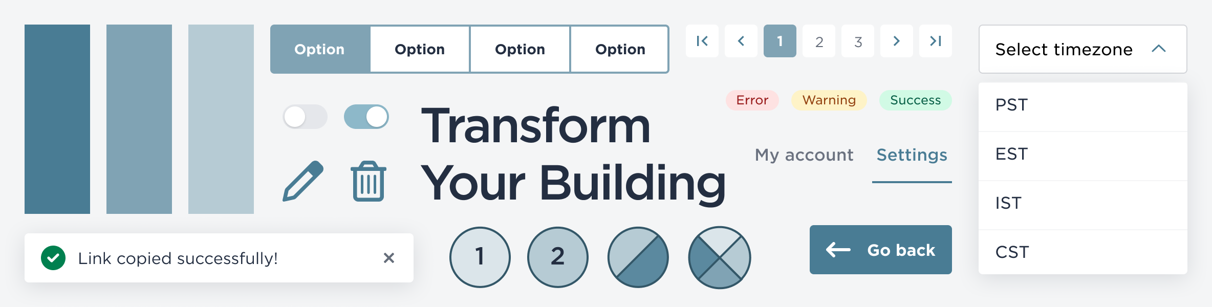
After months of hard work, the resulting design system included 5 colour palettes (2 main and 3 semantic), 12 type styles (a big improvement from the previous 26), consistent elevation and grid spacing guidelines, and 30+ responsive components.
Review & Documentation
The review process was crucial for this project since it would be rolled out to all products at a large scale. Bi-weekly design syncs with the dev and PM teams ensured a comprehensive review of all of the new atoms and molecules I had worked on.
To ensure longevity of the system, we opted for two methods of documentation. Firstly, we kept a detailed Figma document with all linked styles, so designers could quickly and easily add components right into their designs. Secondly, we integrated into Storybook - a tool that allows developers to create organized UI systems.
04 / Results
This project taught me a lot. It gave me the opportunity to collaborate closely with product & dev teams, hone my Figma skills (using variables and styles) and most importantly, it allowed me the freedom to study some of the greatest design systems out there. Learning about design system design from our team was truly an amazing experience, and I gained a huge appreciation for the value of having a robust design system. As a bonus, View's new design system has been well-received, bringing unity and scalability across all the platforms.
As we know, design is a never-ending process. Iteration is key to any good design, and this project is no exception.
Some of the team's next steps include:
- Maintaining up-to-date documentation while building out the system beyond the molecule level
- Creating additional checks to ensure compliance with WCAG guidelines and standards
- Finishing that damn data visualization palette :)
