Gruepr
Fixing the slow adoption of a classroom tool
01 / Background
Gruepr is a desktop app designed to help professors and instructors place students onto optimal project teams. Trusted by 35+ of the top institutions across the globe, Gruepr aims to streamline the process of team formation and ensure that each team has the necessary skills and diversity to succeed.
My Role
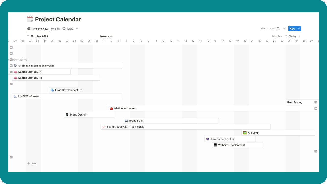
For this project, I was the design lead. I had the opportunity to run and mentor a team of three designers, as well as plan weekly design sprints to deliver the project on time. We were given the following objectives from the client:
- Develop a new brand design that accurately reflects the company's identity, appeals to its target audience and emphasizes the grouper fish
- Redesign the UX and UI for both the responsive marketing website and the desktop application to improve their ease of use, aesthetics, and increase customer adoption
- Keep everything completely free — from the web hosting services down to the typefaces

02 / The Problem
The slow adoption of the application got us asking why
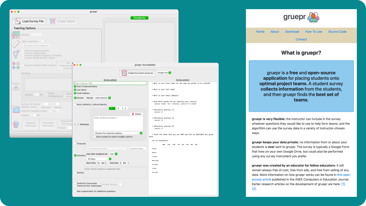
When we started this project, we were given some initial user research. I won’t bore you with all the ins and outs of what was done, but the gist of it was that the UI was clunky, the body copy was confusing and the overall information architecture was misleading. Along with the basic experience issues, there was also no brand design for this tool at all.
Here are some screenshots of the current alpha version of both the marketing website and the tool itself:

03 / The Solution
Rethinking the IA Structure
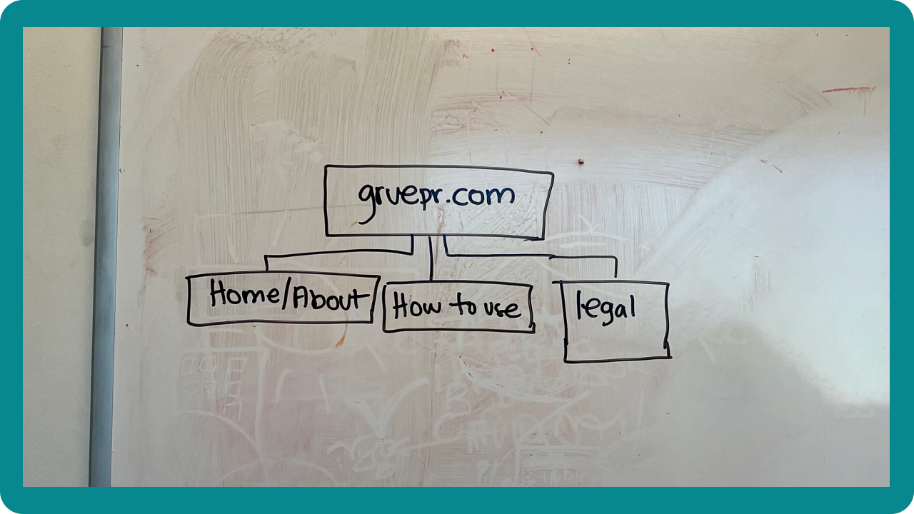
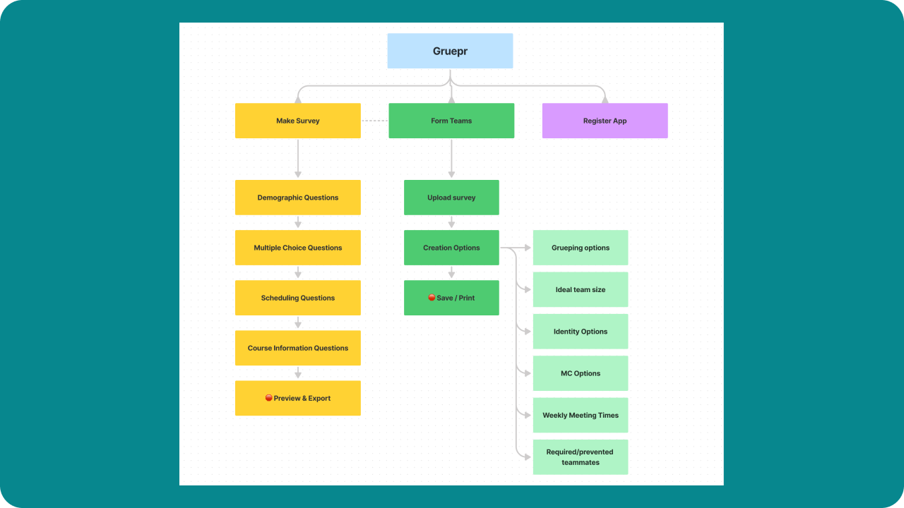
The first step in our redesign was to rethink the IA structure of both the marketing site and the desktop app.
For the marketing site, we wanted to simplify the existing tab architecture from 6 individual tabs down to three, giving users less of a chance to get lost on the website.

On the desktop tool we did the opposite, separating the make survey and form teams experiences into two distinct sections, creating a cohesive and usable flow.

Sketching & Wireframing
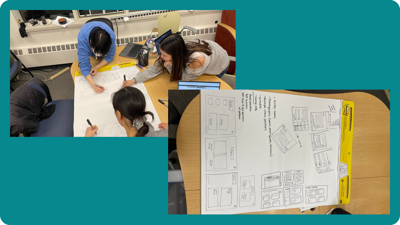
Using this information, I lead the team through a group sketching exercise. The goal was to jot down as many ideas for as many screens as they could in a 2 minute sketch sprint. We would then recollect and see what was working and what wasn’t in each of the sketches and continue drawing.

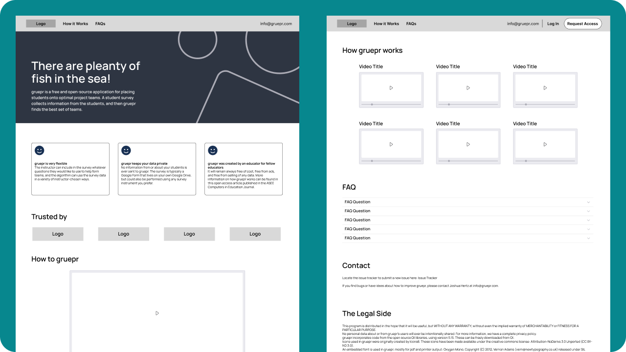
The sketching activity yielded some awesome results, so the next step was to translate them into low-fidelity wireframes to test out different layouts and design concepts on the screen. These wireframes were then reviewed and refined over a two week period by both the client and our development team. This iterative process allowed the team to fine-tune the layout and functionality of the app to ensure that the redesign was addressing the flow issues we were attempting to fix.


Once the wireframes were finalized, the team moved on to the design stage using the wireframes as a guide. This allowed us to focus on the aesthetics and functionality of the app without getting bogged down in the details of layout and navigation. Overall, the wire-framing process was essential to the development of Gruepr and helped to ensure that the final product was intuitive and easy to use for professors and instructors.
Building the brand
Designing the branding for Gruepr was a collaborative process that involved mood boarding, client feedback, and a deep dive into sea puns. To begin the process, the team worked with the client to participate in two branding exercises, to help establish the tone and client needs for this project.
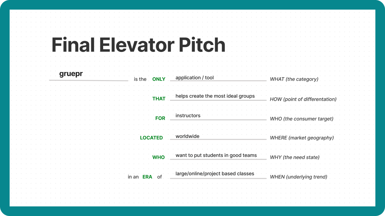
The first exercise we ran through was creating an elevator pitch for Gruepr. The goal for this exercise is to make sure both the team side and the client understands and agrees on the main goal of the product.

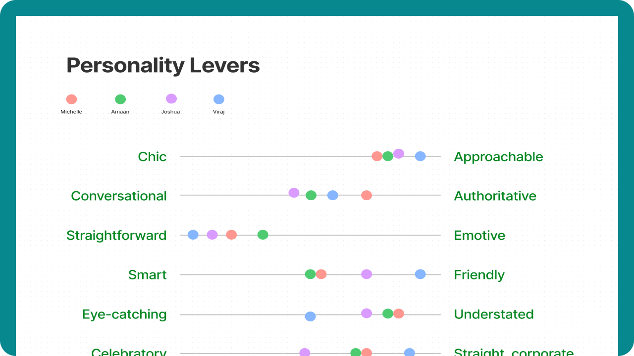
The second exercise helped establish a thoughtful brand identity. In this activity, the client and the team indicated where they believe that the client’s product falls (or think that it should fall) within a certain set of traits.

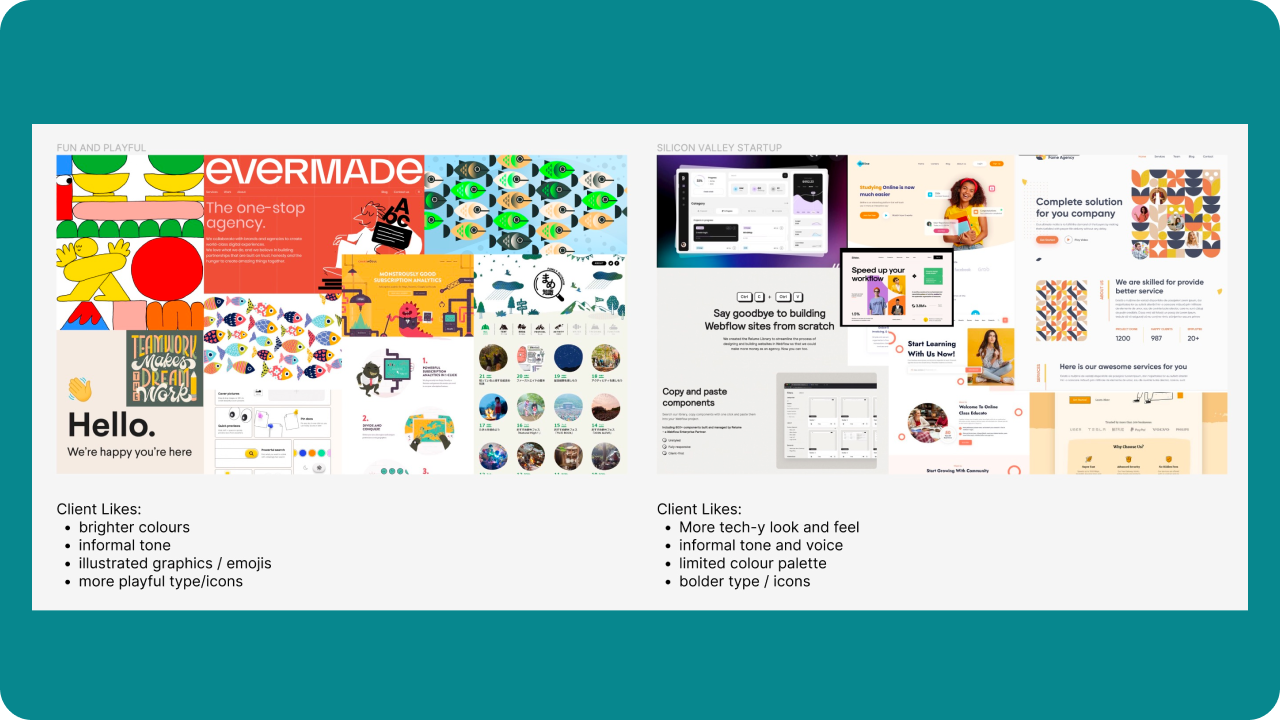
From here, we created mood boards to explore different design concepts and ideas keeping these themes in mind. The mood boards included a variety of images, colors, and copy inspired by various directions each of the designers wanted to take. This activity helped the team synthesize their thoughts on the overall aesthetic of the project.
We then presented two final mood boards to the client for feedback. The client decided that his ideal version of Gruepr sits in between the two final mood boards - combining the more playful and approachable tone of the first one with the refined and clean look of the second. Based on this feedback, the team refined the mood board and began working on style tiles.

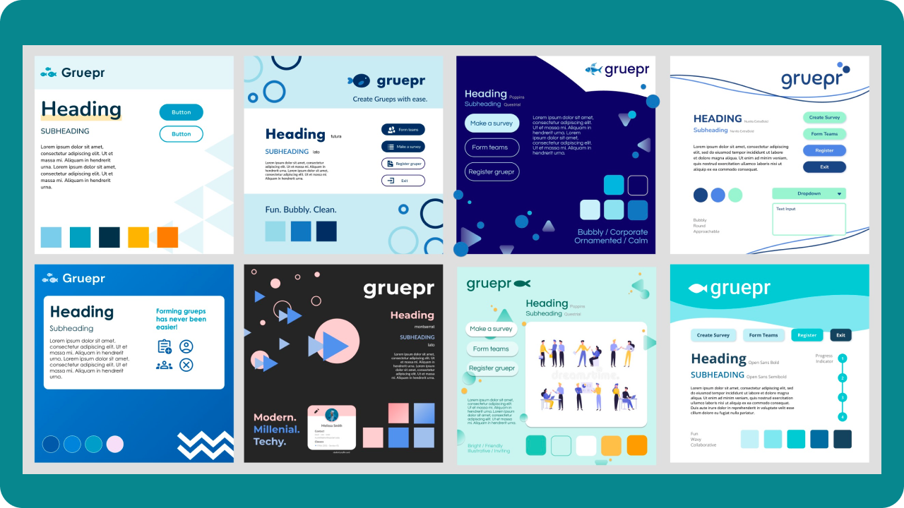
Think of a style tile as a mood board, a way to plot ideas visually, but in a more purposeful layout. Style tiles clearly illustrate the main patterns, colors, brand elements and typography of the style direction.

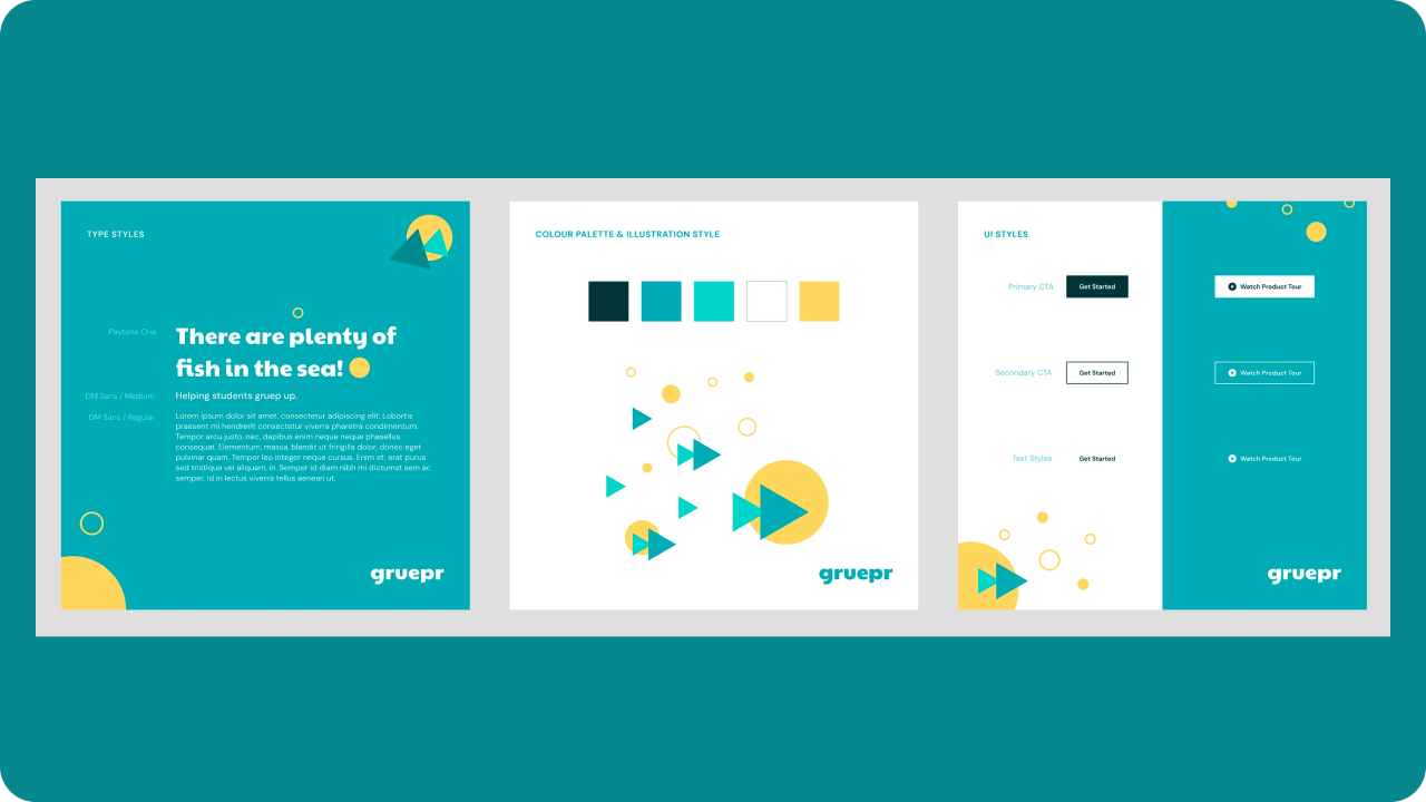
After many rounds of iteration and client feedback, we finally settled on our final brand direction.

The team chose a color palette and font set that felt warm and approachable, but also informative and serious. The color palette included shades of blue and yellow, while the font set features bold, sans-serif fonts that convey the idea of teamwork and collaboration.
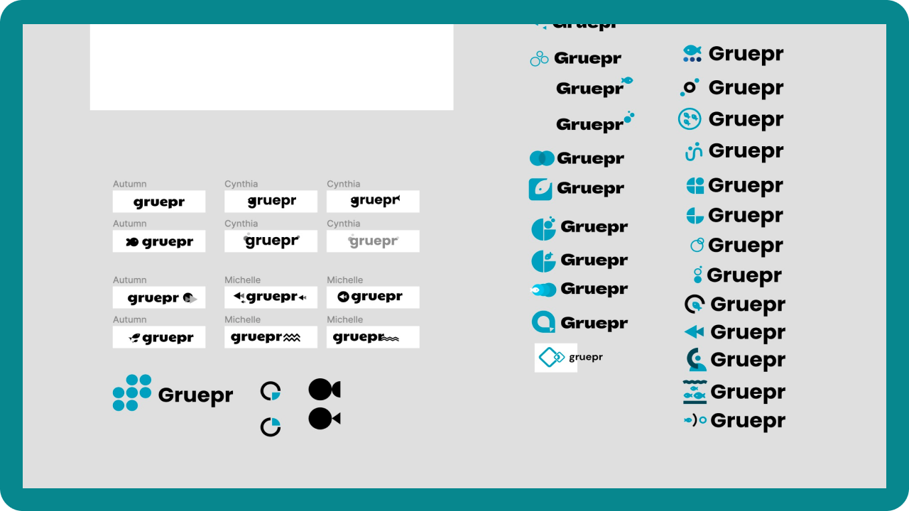
The final element of the branding was the logo. The team designed a number of different logo concepts that incorporated the ideas of grouping and fish in different ways. Here is a really messy screenshot of all of our different ideas:

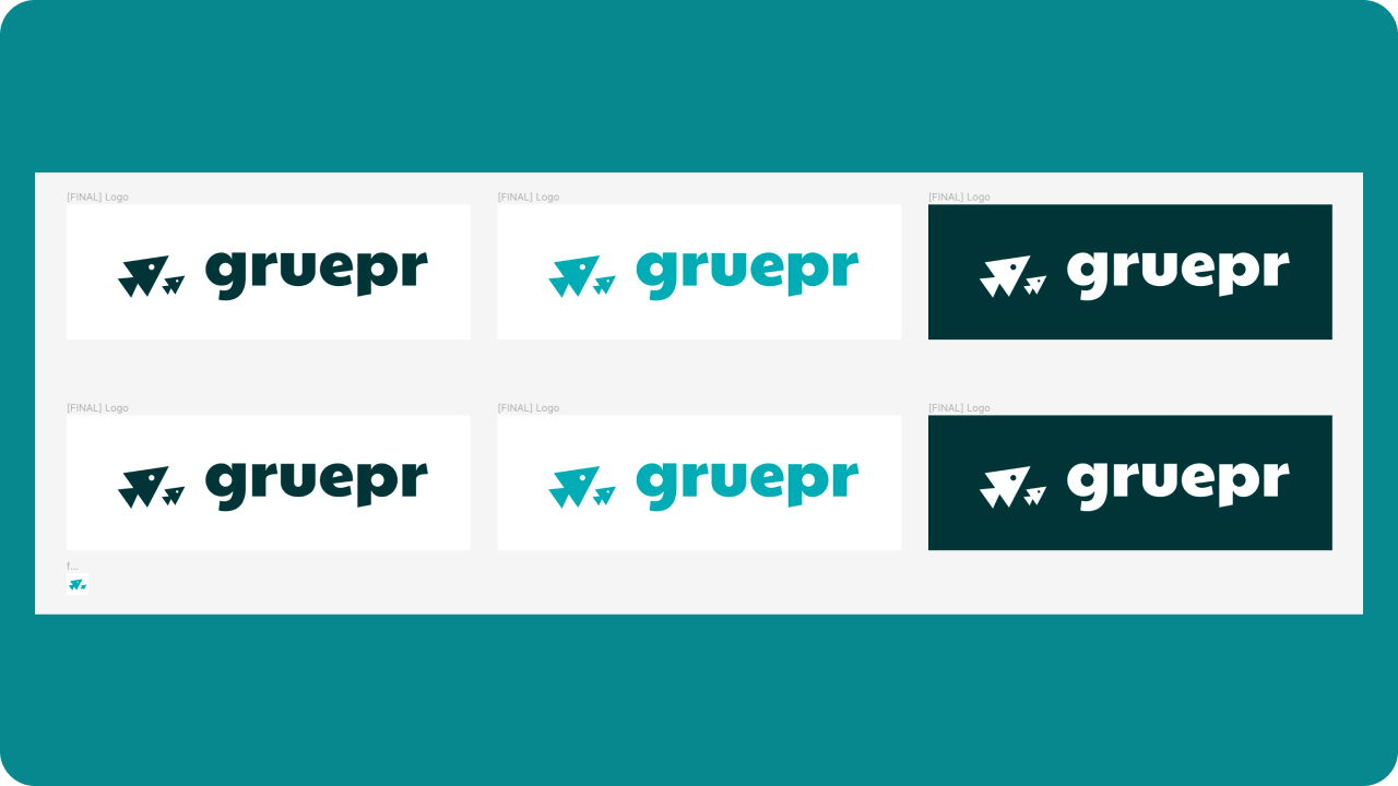
The final logo featured a school of fish with the sharp lines from our fish motif in the branding, representing the idea of belonging, teamwork and collaboration.

Overall, the branding for Gruepr was carefully designed to reflect the fish theme while also conveying a sense of teamwork and efficiency.
Hi Fis
After the wire framing and branding process for Gruepr was complete, the next step was to translate the wireframes into hi-fidelity mockups. The goal of this process was to create a more realistic representation of what the final marketing site and desktop app would look like, while still maintaining the core layout and functionality of the wireframes.
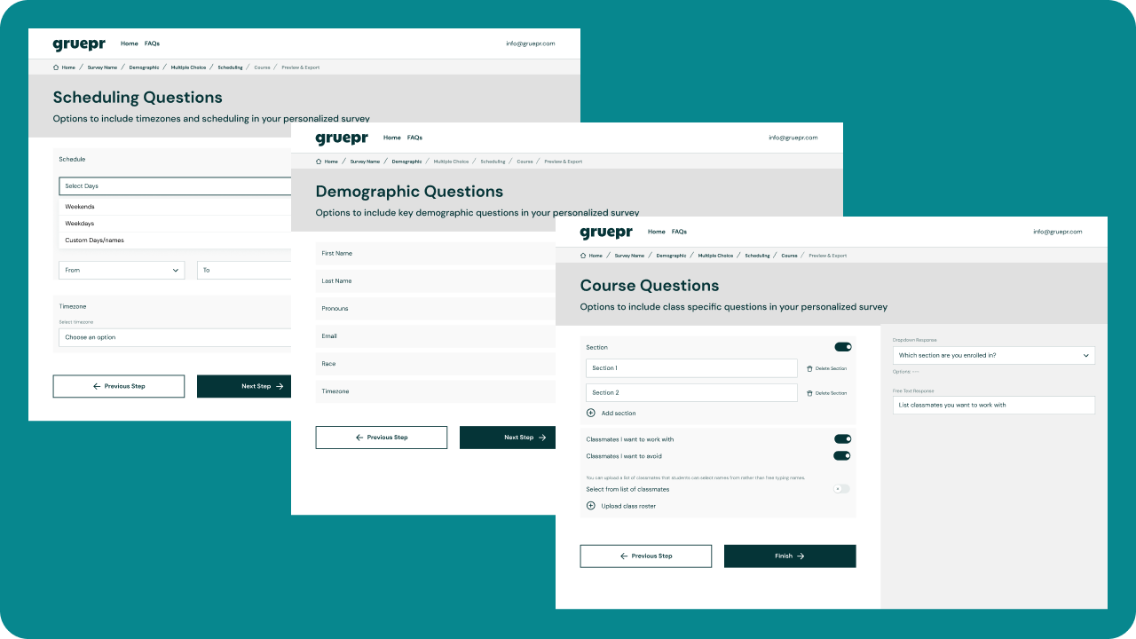
To create the hi-fidelity mockups, I lead the design team through weekly design sprints in Figma, where each week we focused on one section of the experience. For the marketing site, we looked to completely overhaul it, adding in the new design elements such as color, typography, and the fish motifs to create a cohesive and visually appealing design. For the desktop app we leveraged separated the make survey and form teams experiences, and incorporated our updated branding into the screens as well.
Each week we would meet with the client for feedback, making changes to the design as needed.
Marketing Site
Desktop App
Once the hi-fidelity mockups were finalized, they were sent off to the development team for implementation. The development team used the mockups as a guide to build out the app, ensuring that the final product matched the design and functionality of the mockups as closely as possible.
Overall, the process of translating the wireframes into hi-fidelity mockups and iterating on them was crucial to the development of Gruepr. It allowed the team to create a detailed and realistic representation of the app that served as a guide for the development process.
04 / Conclusion
Our redesign of the experience resulted in a 90% increase in user satisfaction with the product, and a 40% increase in downloads of the tool from the new marketing webpage. A quick flash poll showed that users were better able to understand how to use the tool. Additionally, the fish branding brought a smile to an otherwise mundane task.
Gruepr has proven to be an effective tool for streamlining the process of team formation and creating balanced and effective project teams. Professors and instructors have reported that the app saves them time and reduces frustration, while students have appreciated being placed on teams that are tailored to their skills and preferences. As a result, Gruepr has become a popular choice among professors and instructors looking to create optimal project teams.
